Placoter means to chat in Québécois.
Initiated in March 2020, this experimental typographic project explores togetherness in graphic practice in the context of social distancing. Involving 50 participants, Placoter is a typeface conceived collectively, looking at writing from the different perspectives offered by sciences of education on one side (creating meaning with words), and graphic design on the other (tracing forms to create meaning).
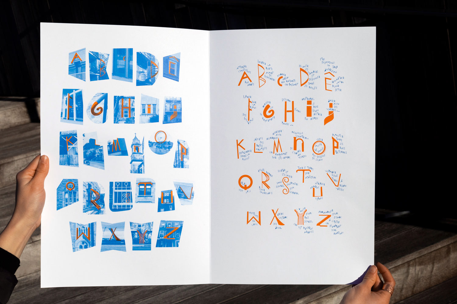
This work is a joint project between the interdisciplinary typographic lab TAO (École de design/UQAM) and students about to graduate and become primary school teachers and pre-school educators. In the midst of the pandemic and remote-studying, the contributors were invited to walk in the neighborhoods while looking for letterforms within the architecture around them. A staircase could become a capital R, or a dormer window an E.
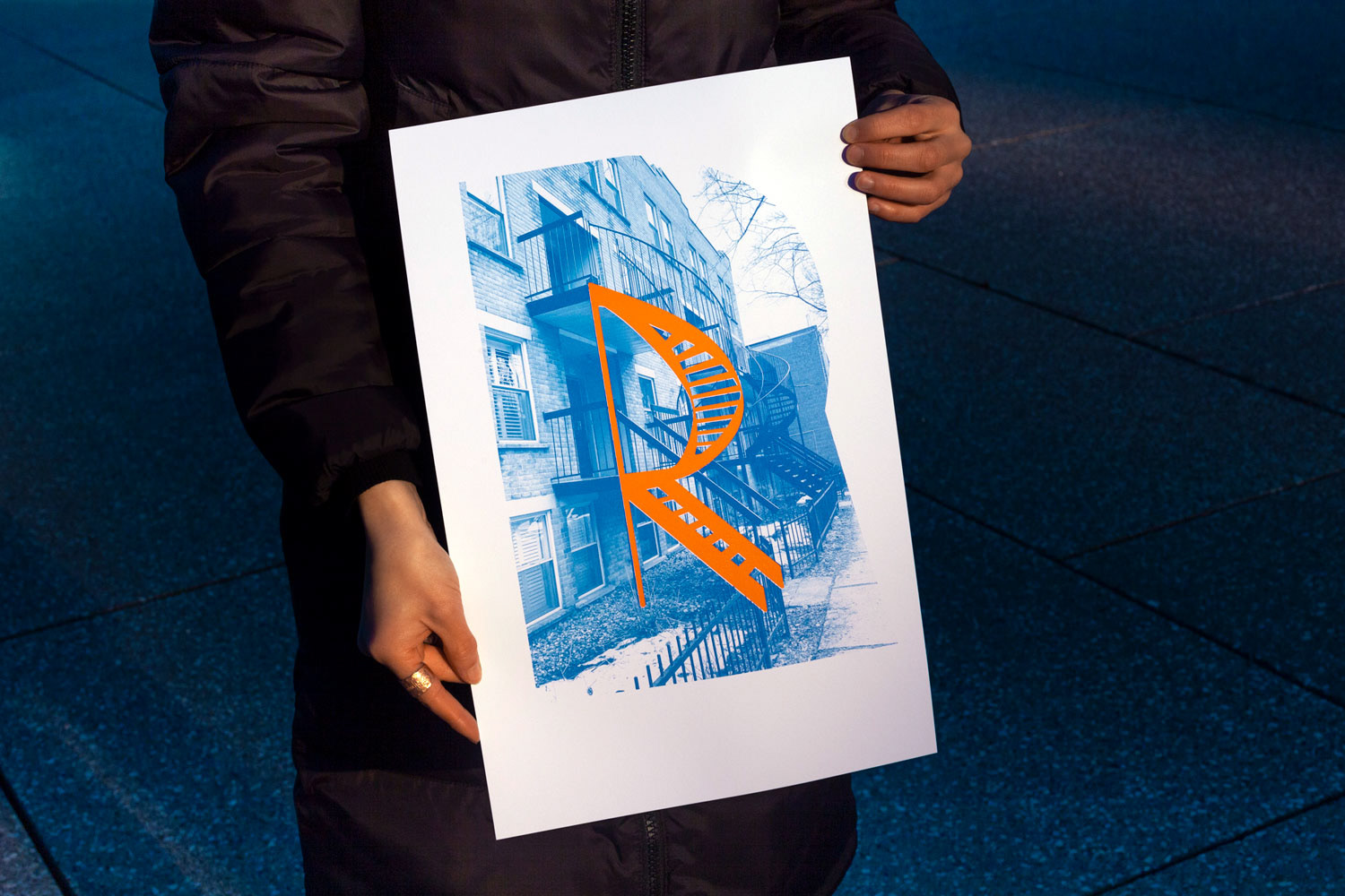
Inspired by psychogeographic practices, this process encouraged deep observation of urban surroundings and of the different architectural languages at stake, while offering a playful approach to identifying letters for a younger audience.
Letter bounties were shared, and letterforms selected to enter our collective abecedarium. Participants also co-redacted a text attracting attention to the sounds of each letter through a loose narration hopping through the cityscape of Montreal.
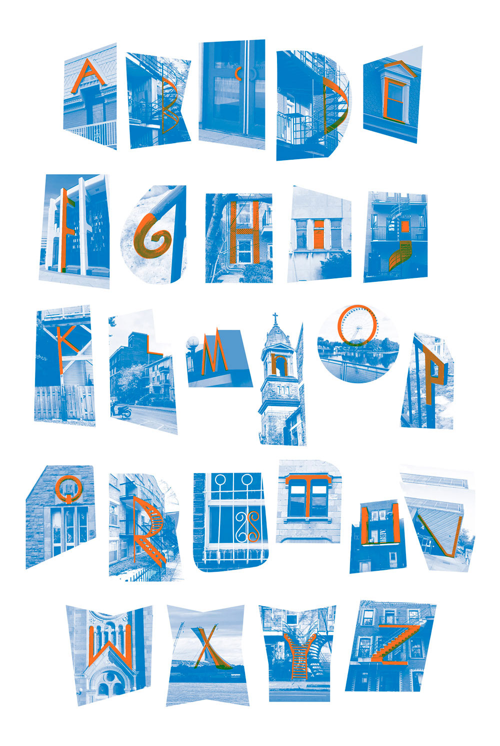
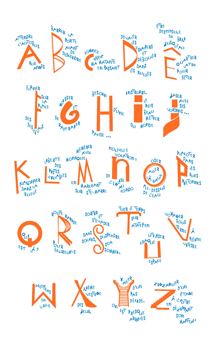
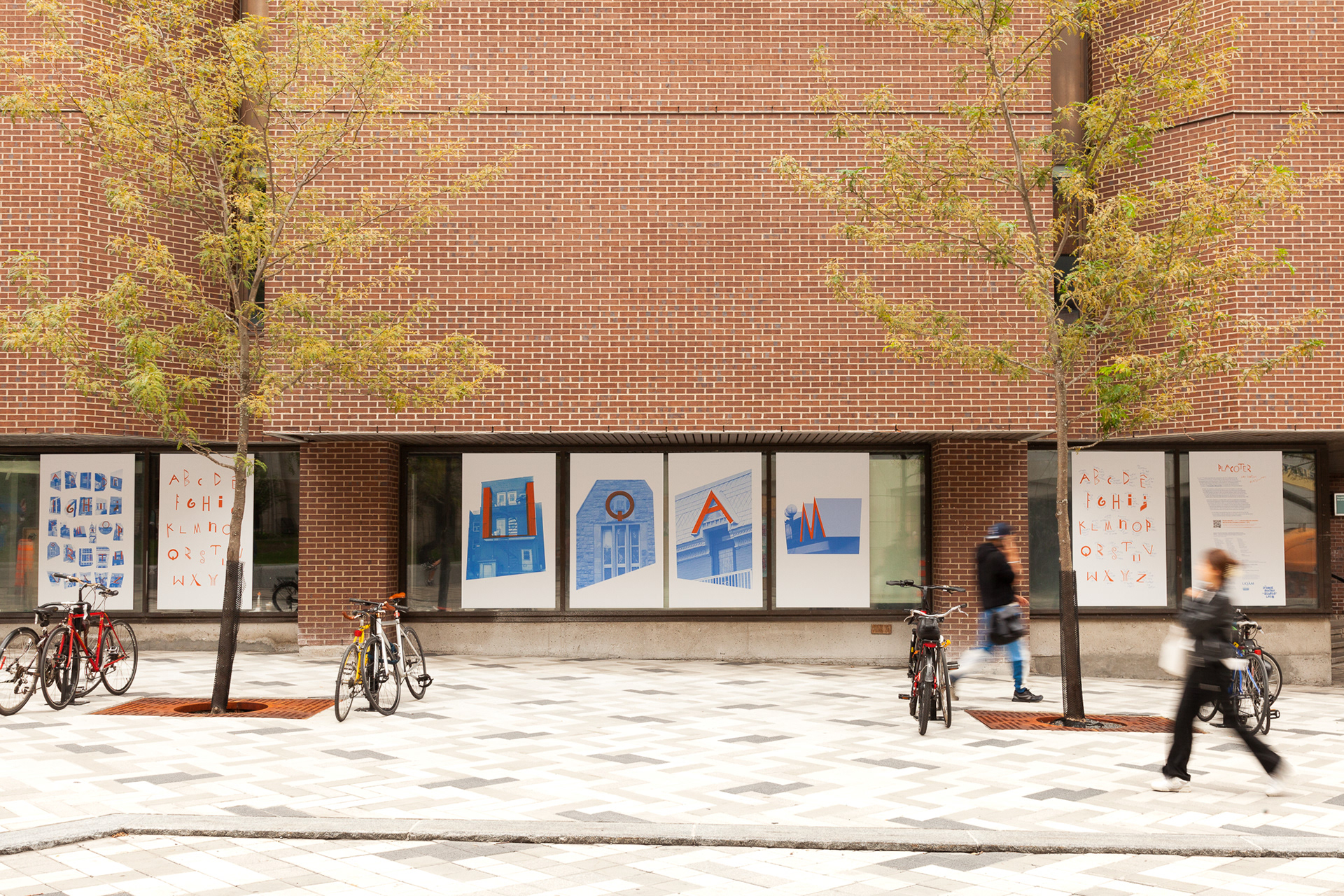
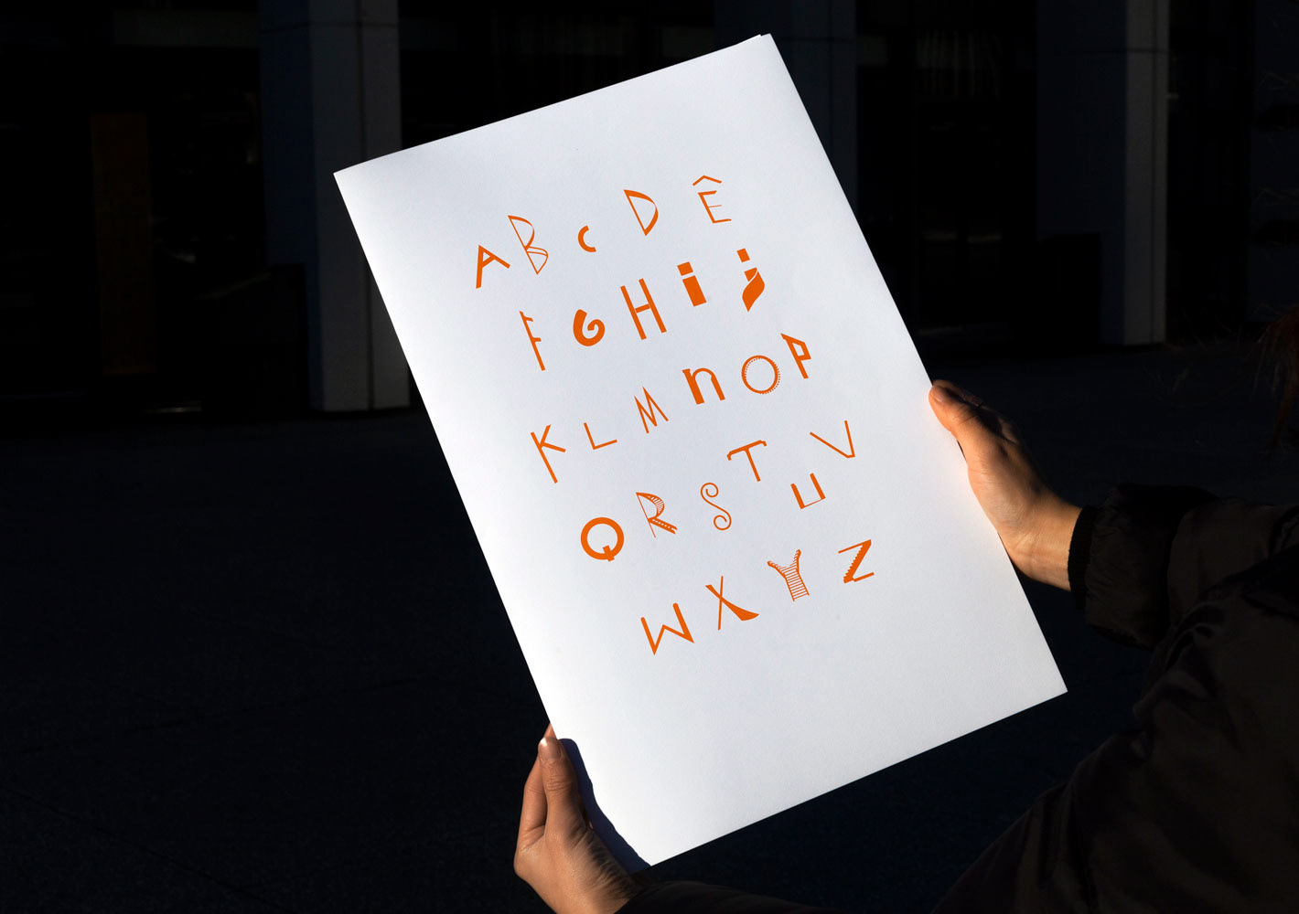
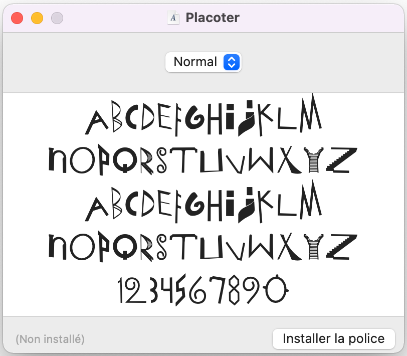
Final letters were redrawn and vectorised with design students, and contextualised within a typographic specimen, three animated pieces, and an installation exhibited in collaboration with the Centre de design, for the launch of Placoter as a typeface. Placoter is licensed under a Creative Commons 0, meaning that it can be downloaded for free and modified, distributed, represented and used in any context without specific authorisation, albeit a mention is always appreciated.
Download it from the website dedicated to the project : http://placoter.org/
or start by testing it here.
Moving image : Carolina Bea / Sound design : Carolina Bea + Laurence Thibault
Contributors :
Prof. Amandine Alessandra
Prof. Ophélie Tremblay
Rute Nieto Ferreira
Mark Anthony Aguirre-Oliva
Carolina Bea
Laurence Thibault
Mauï Auger
Audrey Beaudoin
Jean-François Beaudet
Tricia Bédard-Goyette
Wiem Ben Gaied Hassine
Karyne Bernier
Maude Bergeron
Pierre-Luc Boivin
Meriem Boudeffa
Jade Breton
Charlie Brière-Couture
Catherine Buteau
Malory Chassé
Valérie Desjardins
Noémie Dumas
Paramita Faucher-Nachampassak
Claudia Gay
Camélia Grandchamp-Lapointe
Gabrielle Hébert
Sarah Hénault
Eugénie Labrèche
Tommy Leduc
Maude Lefrançois
Dana Lord-Beaudin
Annabelle Meloche
Laurie Mooijekind
Marie-Pier Morissette
Rosalie Morin-Lévesque
Fedja Nicolas-Joseph
Édith Ouellet
Catherine Perron
Roxanne Perreault
Débora Poirier
Laurence Potvin-Beaudoin
Chloé Quinn
Estelle Rabeuf
Émilie Richard
Catherine Rioux Taché
Sabrina Sadeg
Jasmine Sylvestre
Millie Thivierge
Maude Vadeboncoeur
Raphaëlle Vermette
After a project conceived with Rute Nieto Ferreira for Tower Block Books.
Collection and choice of images-letters, co-edited by the students of the course DDM4101 - Experiential approach, pedagogical projects and resources of the environment, in-depth profile "Literature and creativity" (Department of Didactics, UQAM).
Graphic design, animation, typography co-edited with students of École de design (UQAM)
This project was made possible by a grant from the Programme d’aide financière à la recherche et à la création (PAFARC) of the Université du Québec à Montréal in the context of Amandine Alessandra’s research on Togetherness: Experiencing reading (L’expérience lisible : L’être ensemble).